History of the Club Uniform
Over the years, Nowra Athletics Club has seen several evolutions in its uniform design — each one a reflection of the Club’s growth, identity, and spirit. While the colours have remained consistent — yellow/gold, black, and white — their presentation has changed to suit the times and the athletes who wear them.
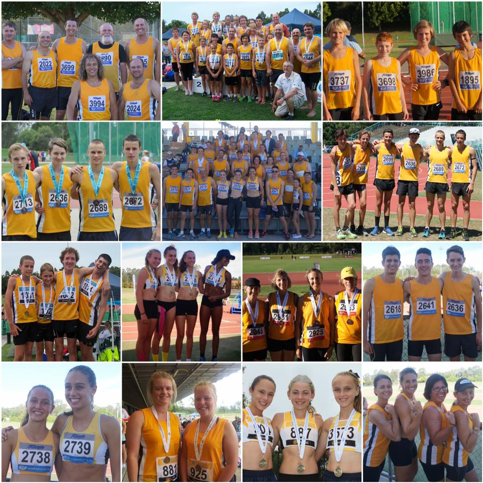
In the early days, the uniform featured a vibrant gold as the dominant colour, accented with minimal touches of black and white. This bold and bright design captured the energy of the Club’s early years.
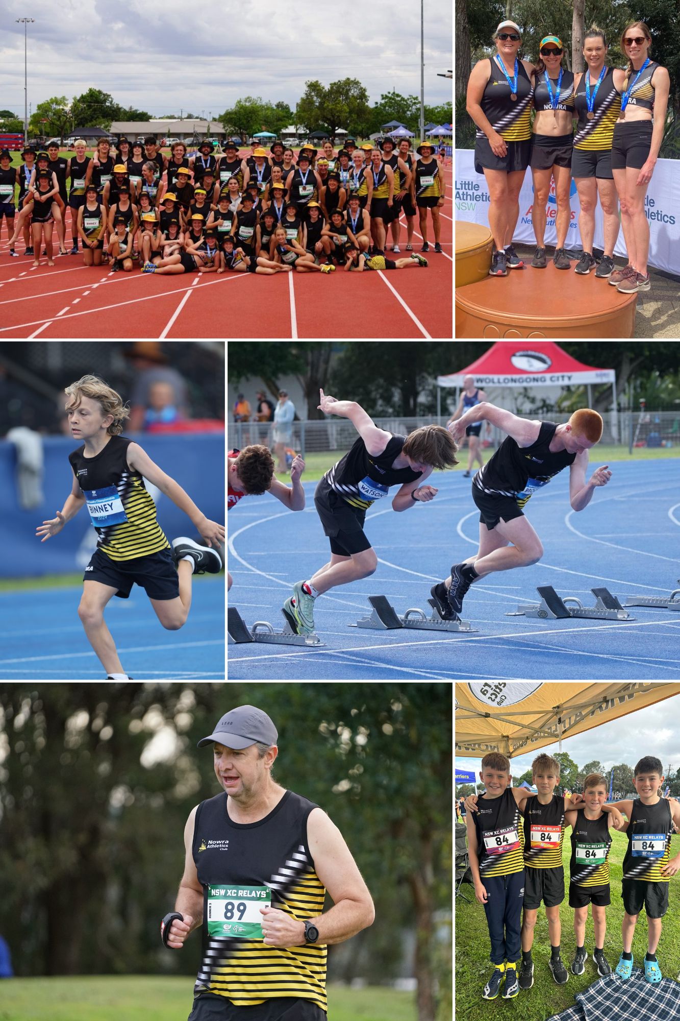
By August 2017, after extensive discussion and feedback — particularly from our younger athletes, who found the design a little too ‘retro’ — the Club launched a new, modern uniform. This updated look made black the dominant colour, with striking accents of yellow/gold and white. The new design retained the traditional Club logo, blending heritage with a sleek, contemporary style.
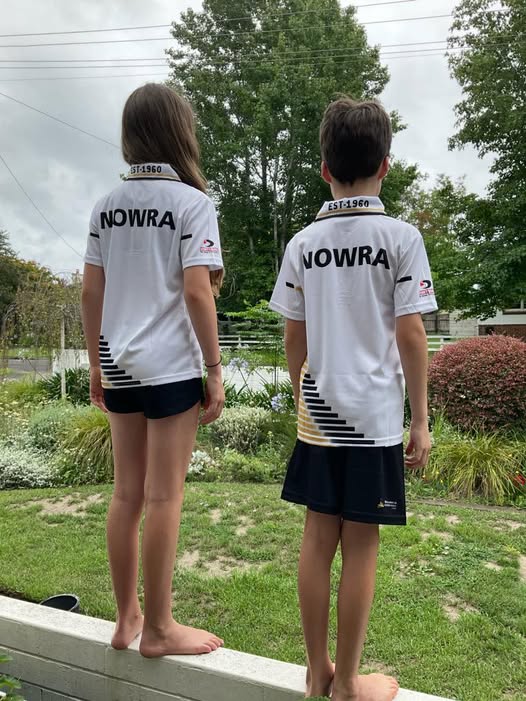
The diagonal stripes, inspired by the Club polo shirts, were added to the running singlets, and the word “Nowra” was proudly displayed on all uniform pieces to ensure our athletes were easily recognised — whether on the track, in the field, or across cross country courses.
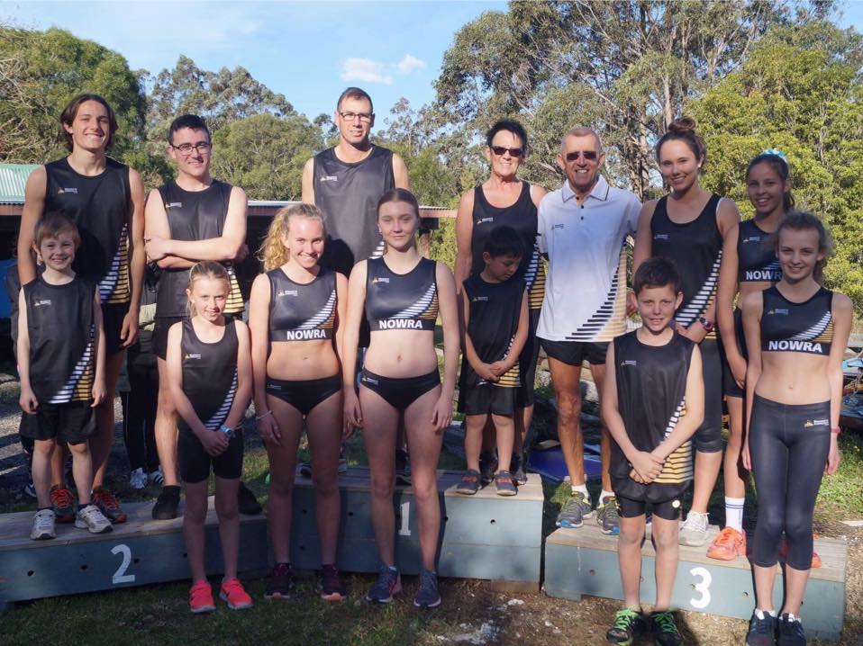
This redesign was more than just a new look. It represented a symbolic shift for the Club — a respectful nod to the past and a bold step into the future. The sharp black and fast-moving stripes were chosen to convey speed, strength, and competitiveness, hallmarks of the Nowra Athletics Club identity.
The shape and colour of the 2017 design have been tweaked over time to improve the fit and feel whilst competing and to make a bolder impression. The current uniform reflects the quality and character of our athletes, making an impact wherever they compete — and standing as a visual representation of a new era of growth, pride, and performance for our Club.